Supply Chain Mapper
Live demo, synthetic dataWhich suppliers look safe on a scorecard but would take the network down?
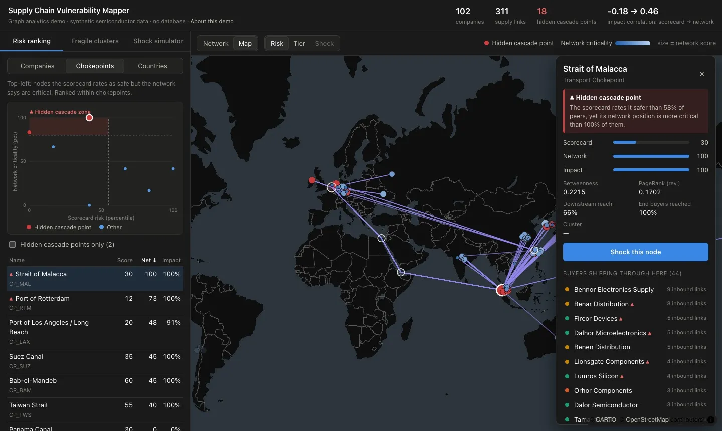
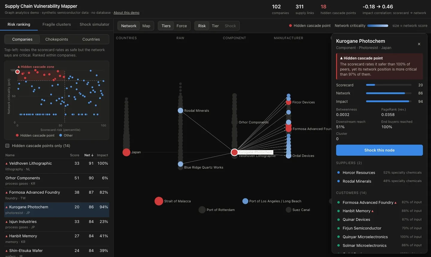
A semiconductor supply chain modelled as a graph: five tiers of companies, the countries they sit in, and the shipping chokepoints their goods pass through. It compares a traditional per-supplier risk scorecard with network metrics to find hidden cascade points, then simulates how a shock spreads week by week.
What it does
- Network score blends betweenness, reverse PageRank weighted by supply share, and downstream reach.
- Validates itself: each supplier is removed in a Leontief model and lost output is measured. The network score tracks that impact; the scorecard does not.
- Shipping chokepoints such as the Taiwan Strait, Malacca and Suez are nodes, so disruption can target a route, not just a company.
- Finds fragile clusters with Louvain communities, scored on single-source dependence and country concentration.
- Week-by-week shock simulator with lead-time lags, inventory buffers, surge capacity and recovery.
Built on synthetic, fixed-seed data with fictional companies.